User personas
Two people use SchoolX every day, each with their own interface.
| The school admin | The class teacher | |
|---|---|---|
| Who they are | Runs the school's records, staff and academic terms | Teaches one or more classes and tracks each student |
| Goal | Keep teachers, subjects and terms organised in one place | See their classes, record grades and give feedback |
| Needs | A teacher roster with clear status, and quick search | Class lists, student profiles, assessments and comments |
| Challenges | Records spread across disconnected tools | No single view of a student's progress across the term |
The Research
Most school management tools are built for large schools with big budgets.
What I found
- – Teacher records, subjects and student data live in separate tools
- – New admins need training before they can do anything
- – No single place to see a class and each student
- – Grading and feedback happen on paper or in spreadsheets
- – Tools built for large private schools
- – Clunky and overbuilt for small and mid-sized schools
Design decisions
Designed backward from the admin's first week, not the system's full feature set.
Learn by doing
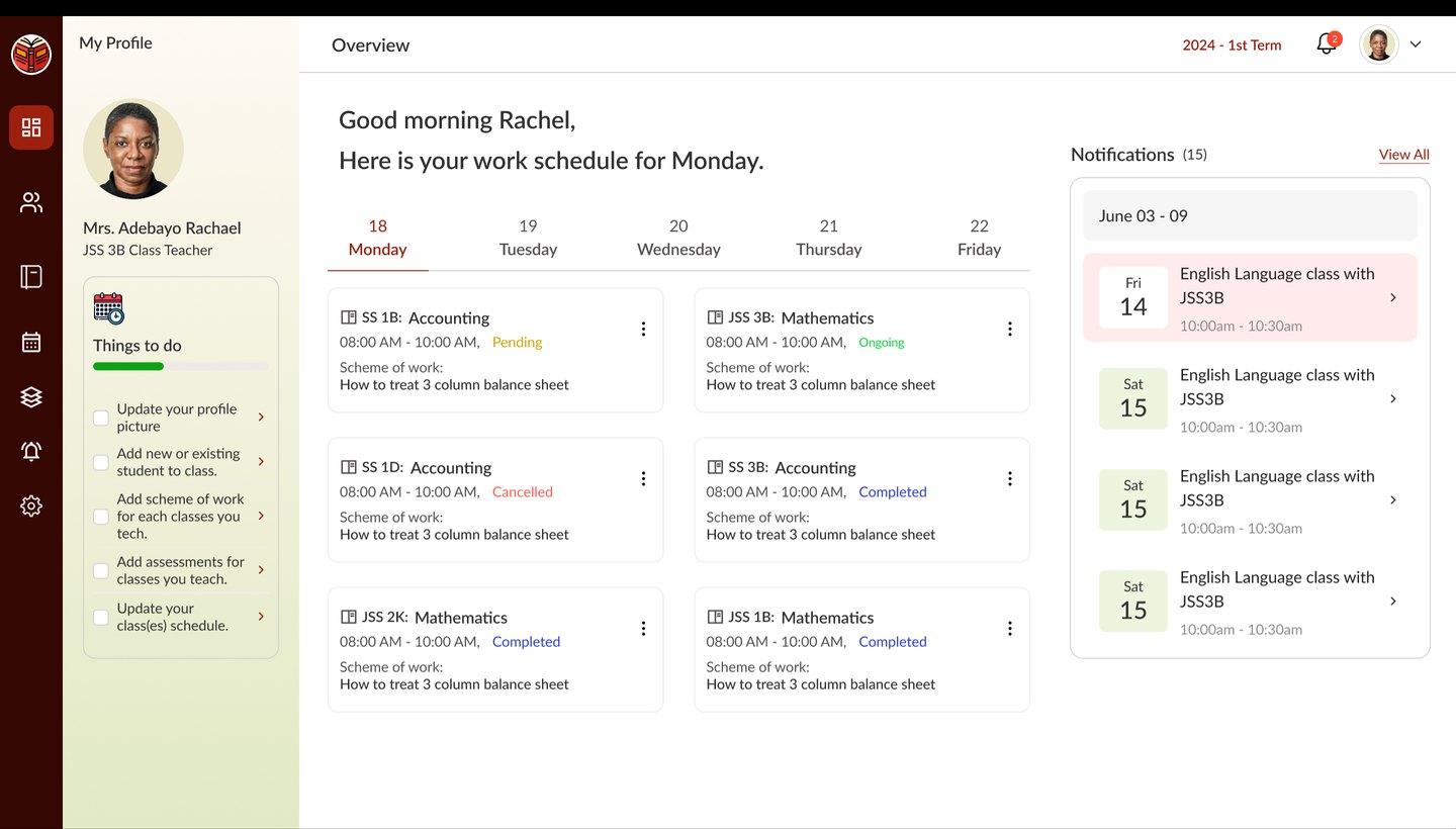
If a first-time admin couldn't manage a teacher record or assign a subject in their first few minutes, the design had failed. That led to the "Things to do" checklist: new users learn the system by completing real tasks, not reading documentation.
How I set it up
- – Teacher roster with Active, Suspended and Left status
- – Search teachers by name or ID
- – Term-based navigation
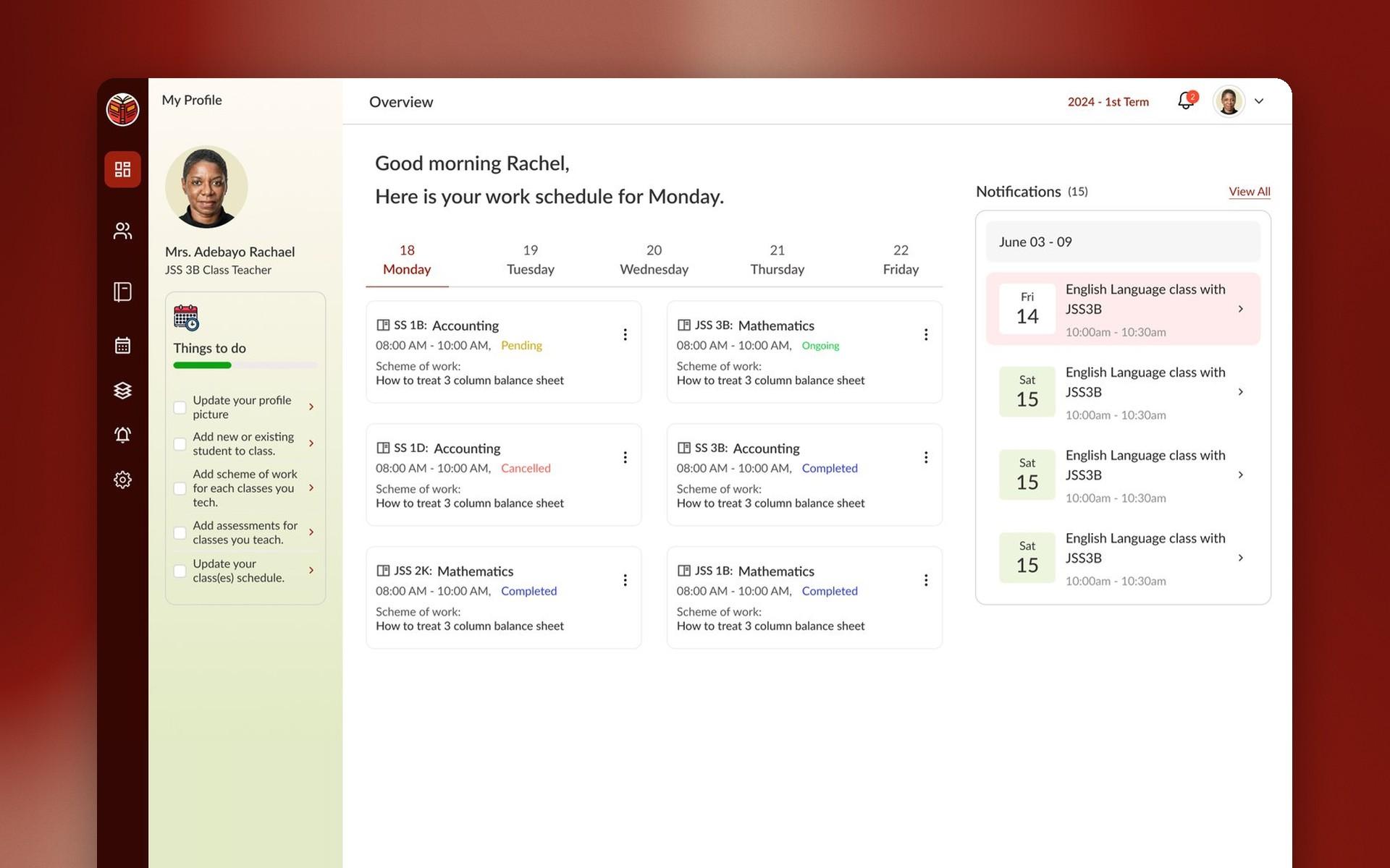
- – Weekly schedule on the dashboard
- – Class lists and student profiles
- – Assessments, grade reports and comments
- – One table-and-status-pill pattern everywhere
- – A warm palette that feels less clinical than enterprise school software
The core screens
From signing in to giving feedback on a student.
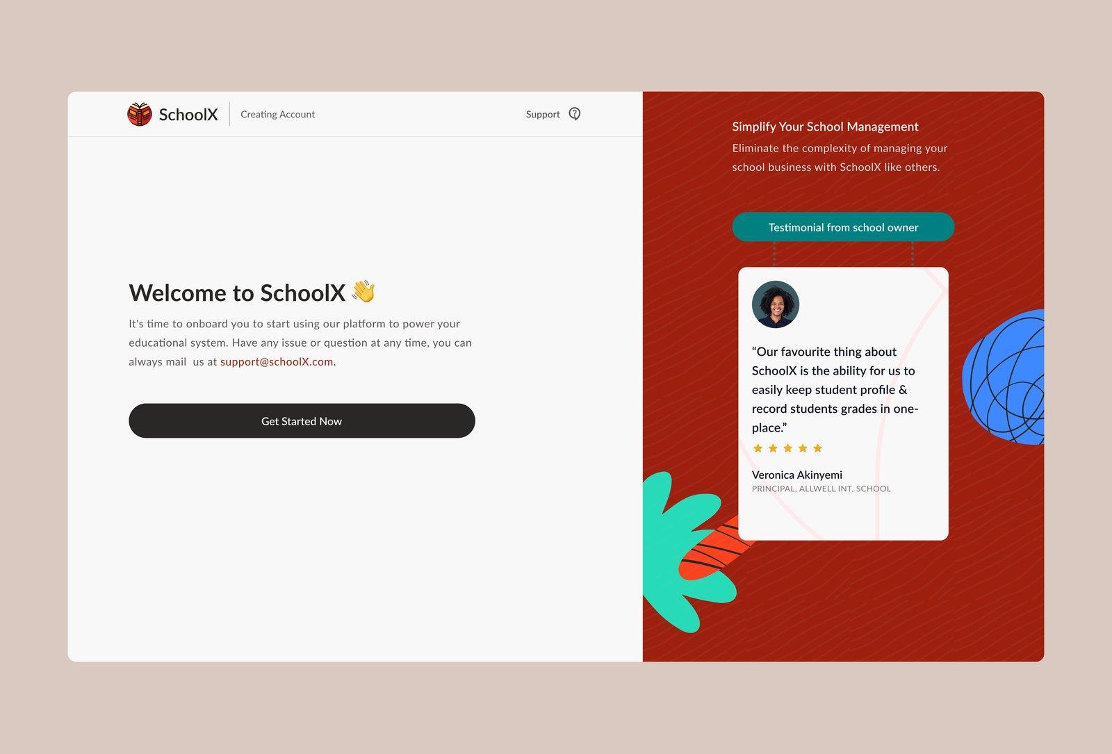
[1] Welcome
New schools start from a welcome screen with a single call to get started, beside a testimonial from another school.
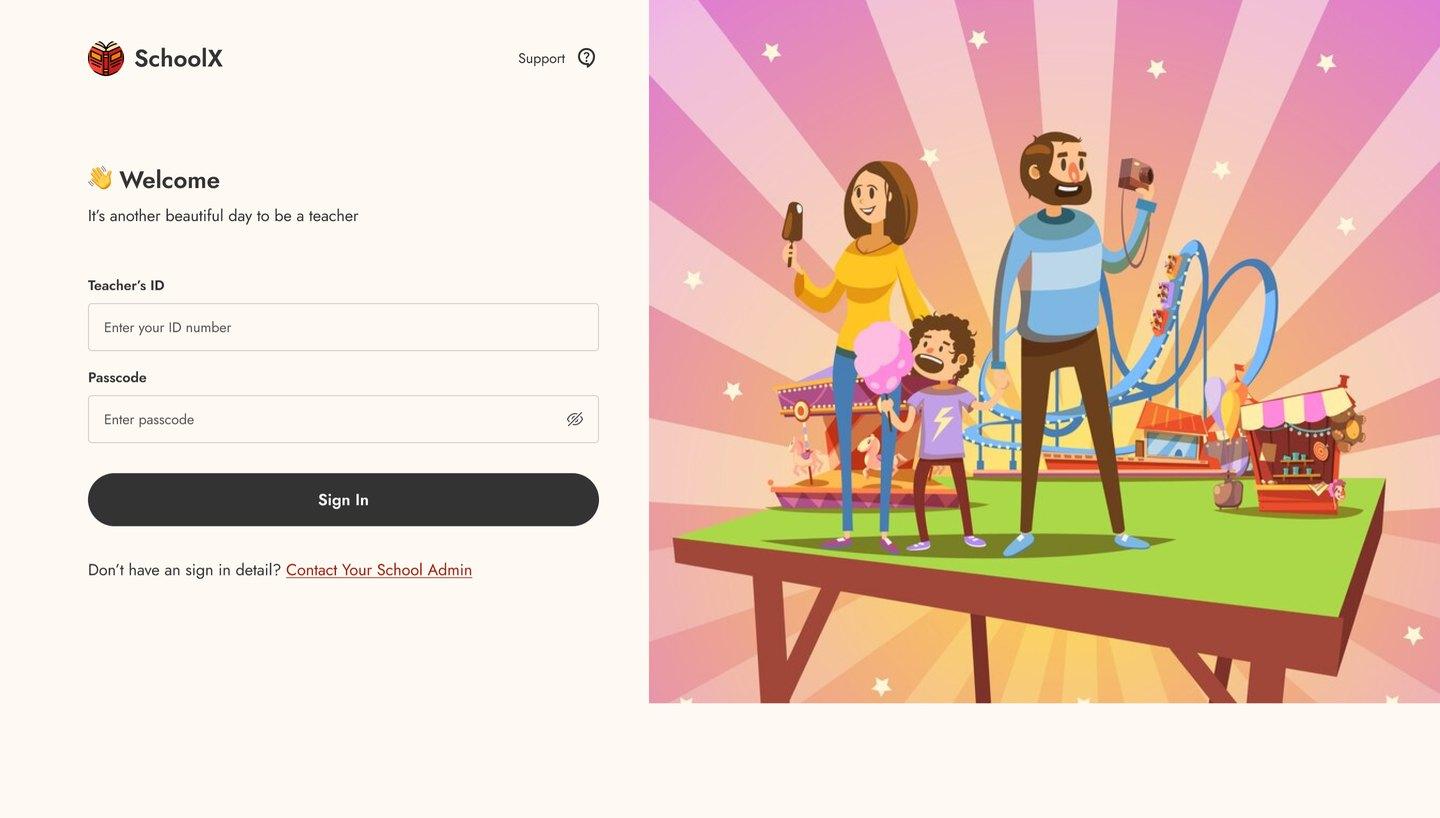
[2] Sign in
Teachers sign in with their teacher ID and password.
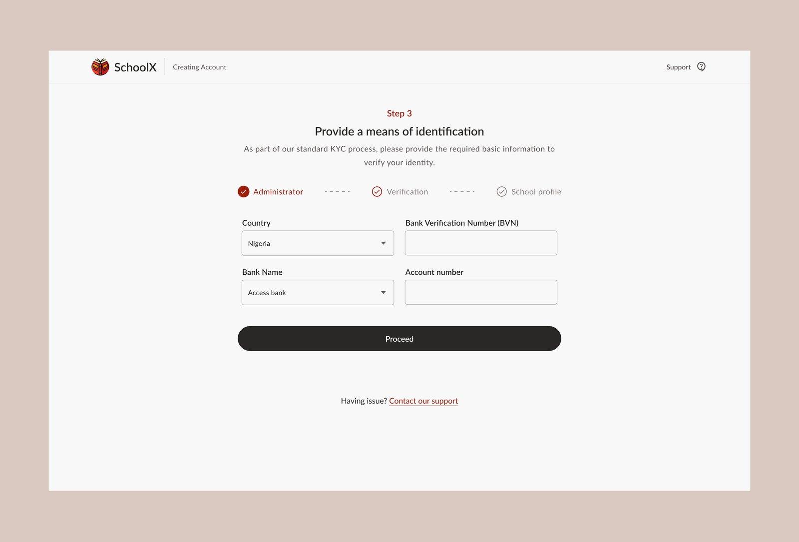
[3] Onboarding
New schools set up their account step by step, including identification for verification.
[4] Dashboard
The week's class schedule and notifications, with the "Things to do" checklist on the left.
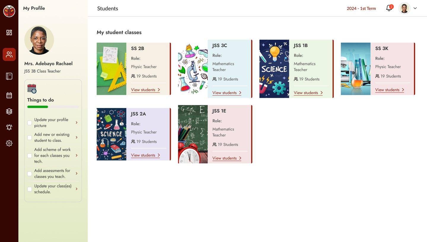
[5] My classes
Each class card shows its subject and student count.
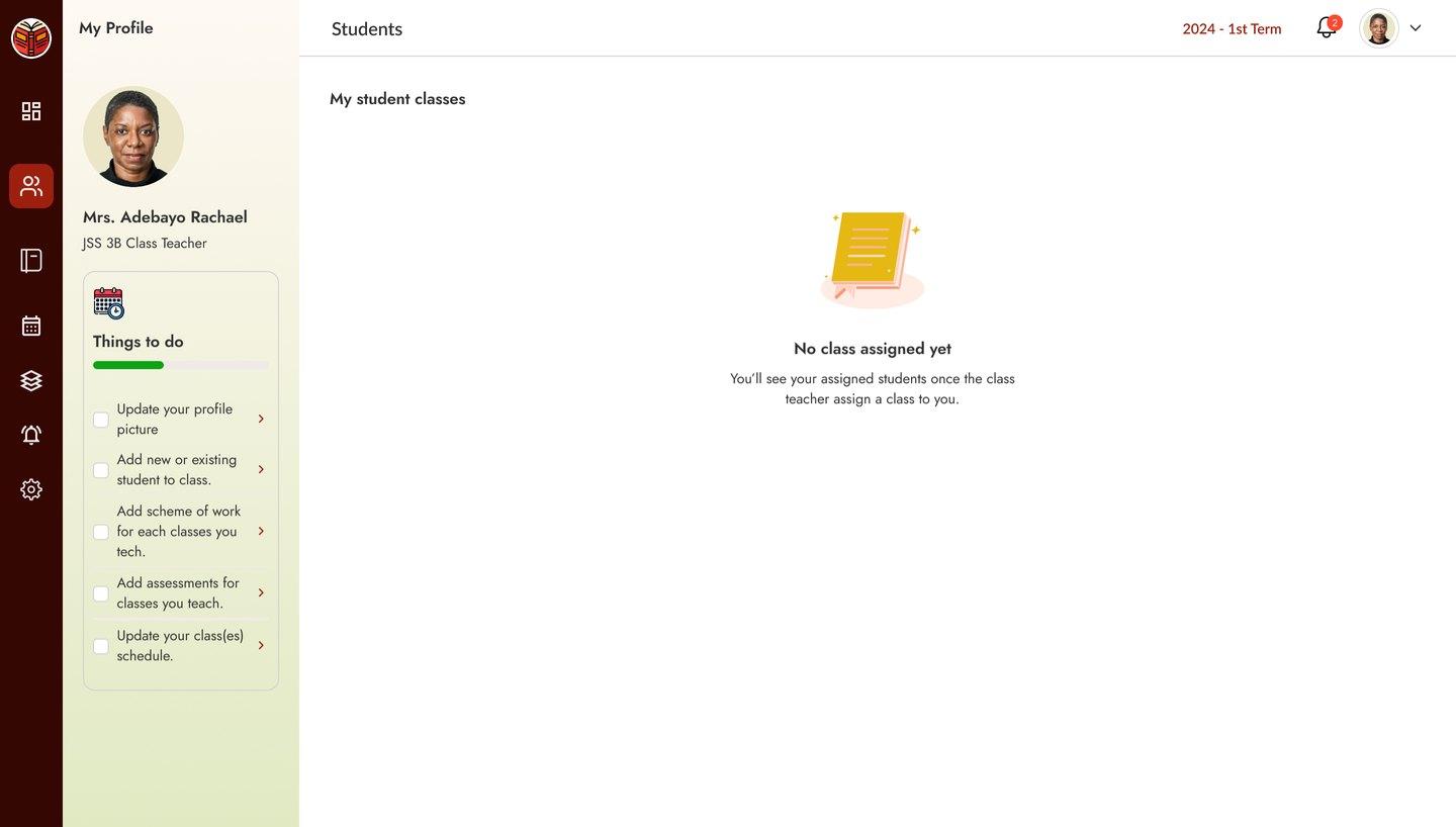
[6] Empty states
Before a class is assigned, the page explains what will appear and why it is empty.
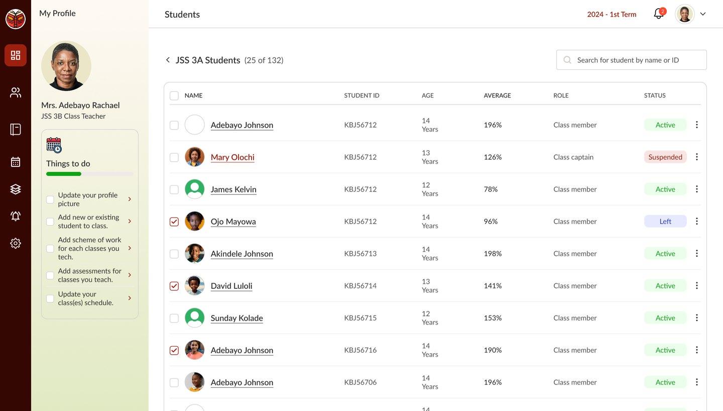
[7] Class list
Every student with their average, role and status.
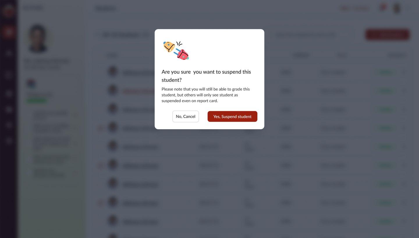
[8] Suspending a student
A clear confirmation explains what suspending means before anything changes.
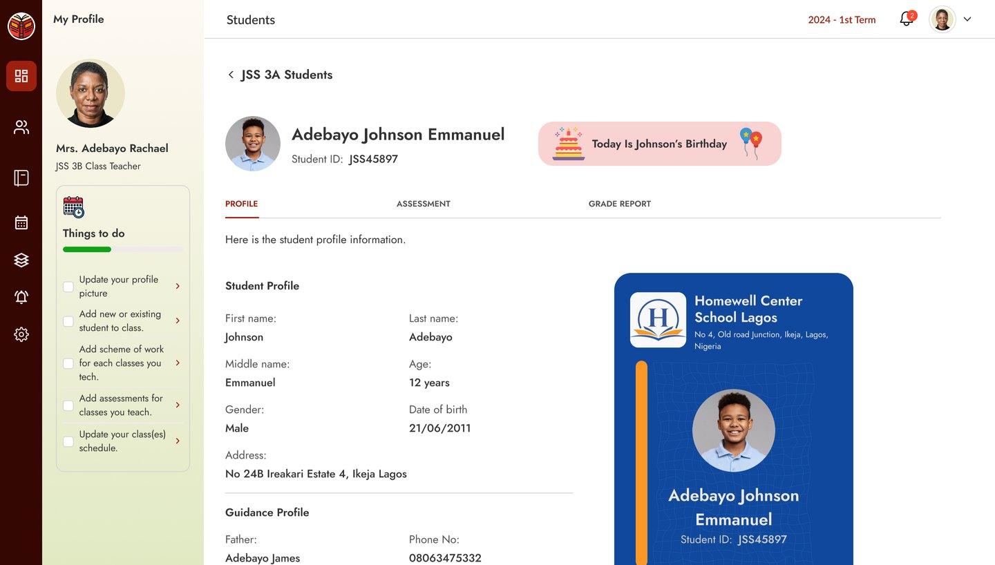
[9] Student profile
Personal details and a student ID card in one view.
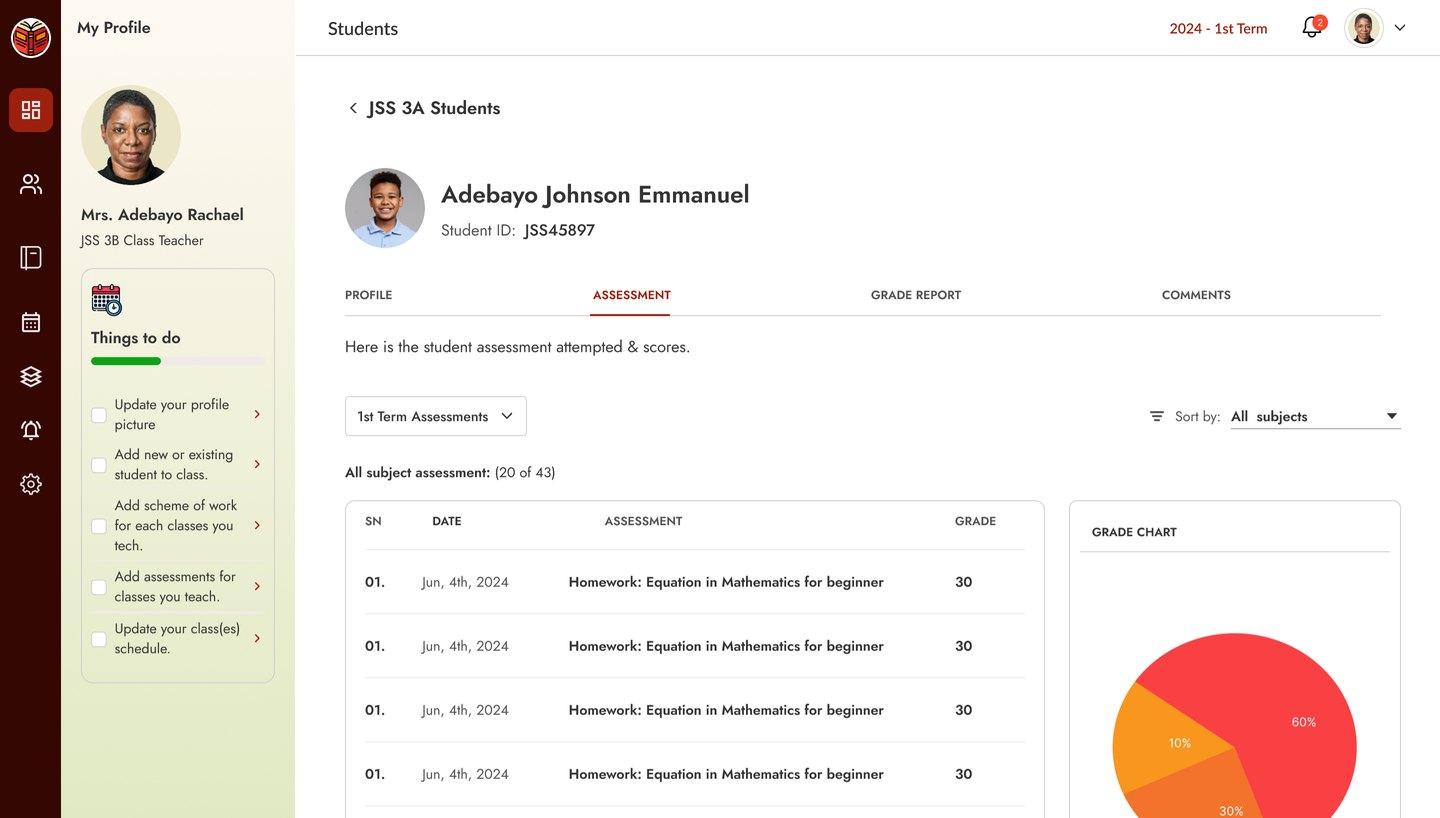
[10] Grades and assessments
Term grade reports and assessment results, with a grade chart.
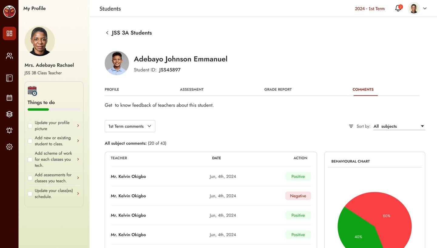
[11] Teacher comments
Feedback from every teacher on a student, with a behaviour chart.
See the full project
These are the core screens. The full SchoolX project, with every flow and state, is in the Figma prototype.
View full project on FigmaOutcome
Delivered as an interactive Figma prototype for client review and handoff.
What I learned
Just listening to how users actually work, and documenting their workflow when there was no existing software to learn from, went a long way on this project.
I also came to understand the importance of focusing on what users need most now, and what they will need next.