Who, why, and what
This was a new product, not a redesign. I started by learning how public-sector lending actually works.
Research
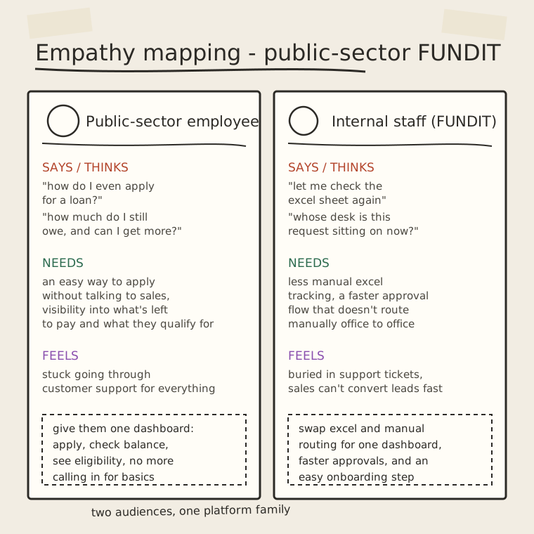
I ran discovery sessions with the public-sector sales team and the operations team. Eligibility rules, verification steps and the approval chain were nothing like Digiit's corporate lending, so I mapped the whole workflow before drawing a screen.
Report from discovery meeting
From discovery sessions with the sales and operations teams.
- “Can I get a loan?”
- “How much do I qualify for?”
- “How much do I still owe?”
- “Where is my application now?”
- “Which office has this file?”
- “Who still needs to approve this?”
- “Is this the latest Excel sheet?”
- “How many loans are pending?”
- “How do I onboard this employee faster?”
- “What documents do they need?”
- “Why is this application stuck?”
Who uses it, and what was missing.
Scope
The first release covered the full loan journey for employees and a single review queue for staff. It deliberately left out anything the contract with each government agency didn't yet allow.
Moodboard
I worked from the same moodboard as Digiit, so both products share one visual direction.
Structure and flows
Different lending rules meant a separate product, built on the same visual language as Digiit.
Two dashboards, one workflow.
Every screen on the employee side feeds a step in the staff review queue, so I designed both sides together and could see exactly where one handed off to the other.
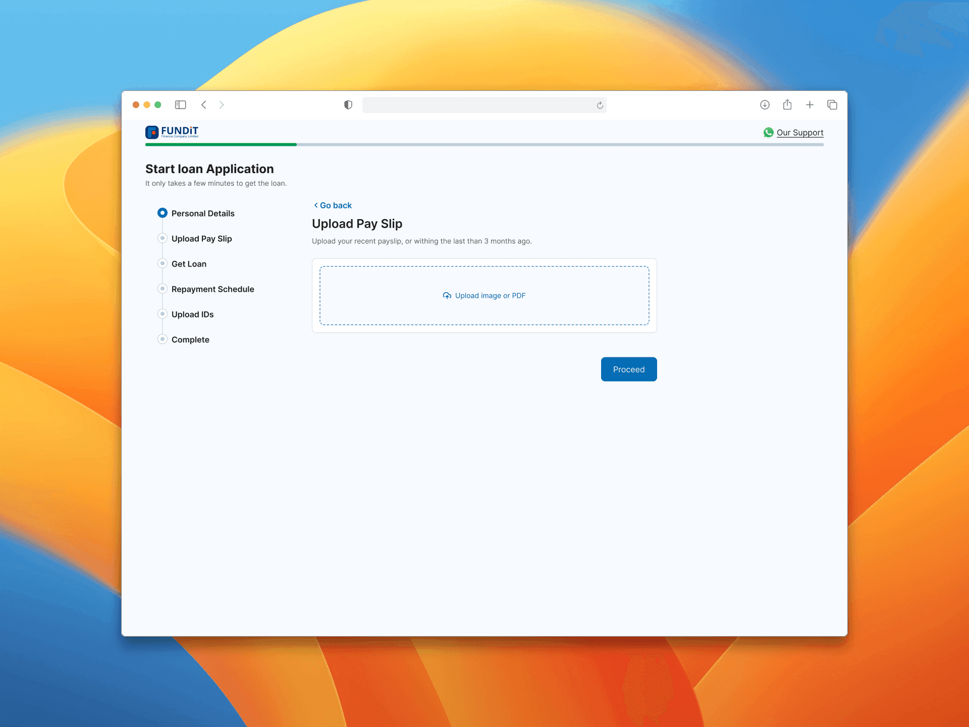
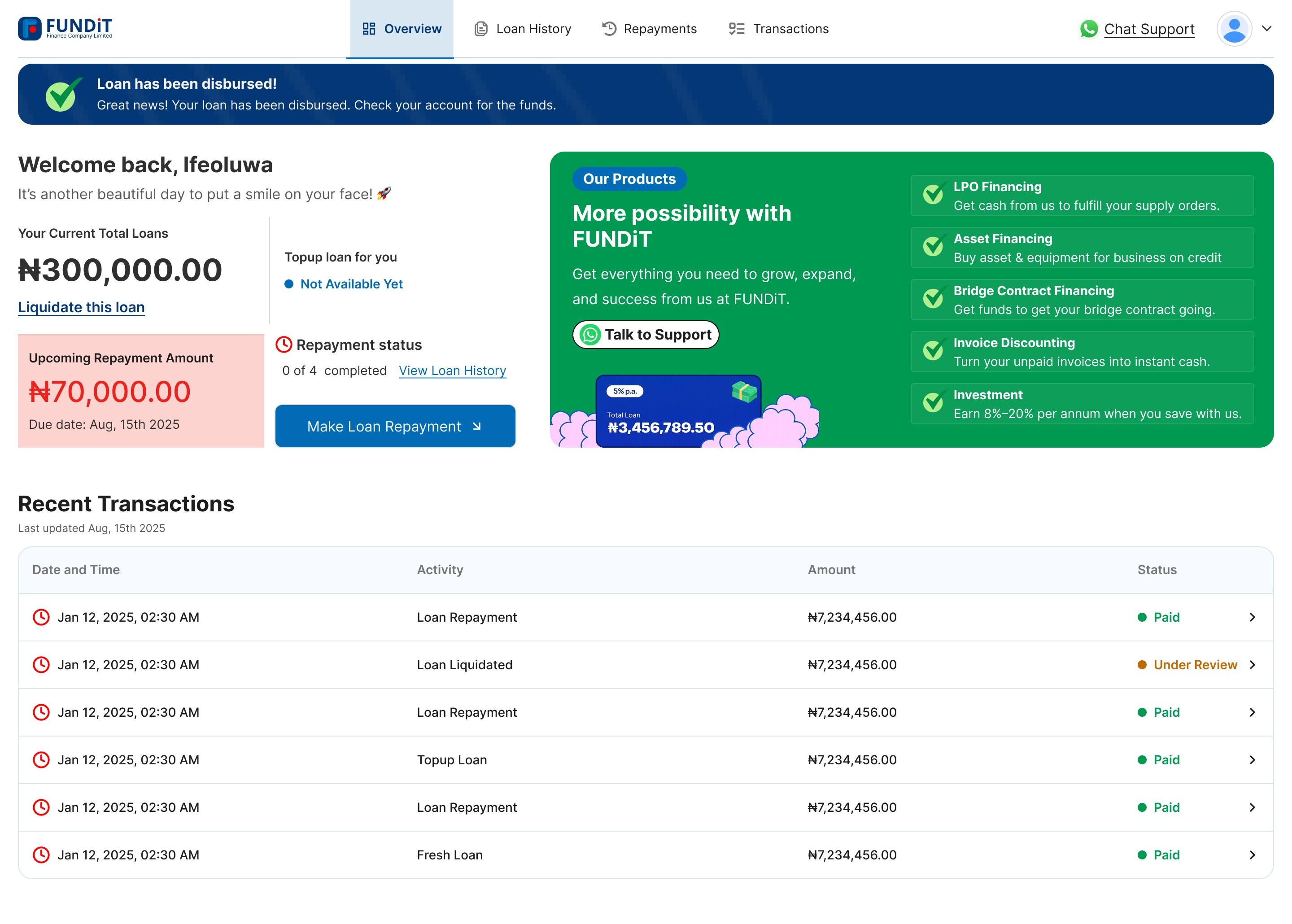
[1] Employee dashboard.
Employees apply, check their balance and see how much more they qualify for, without calling sales or support.
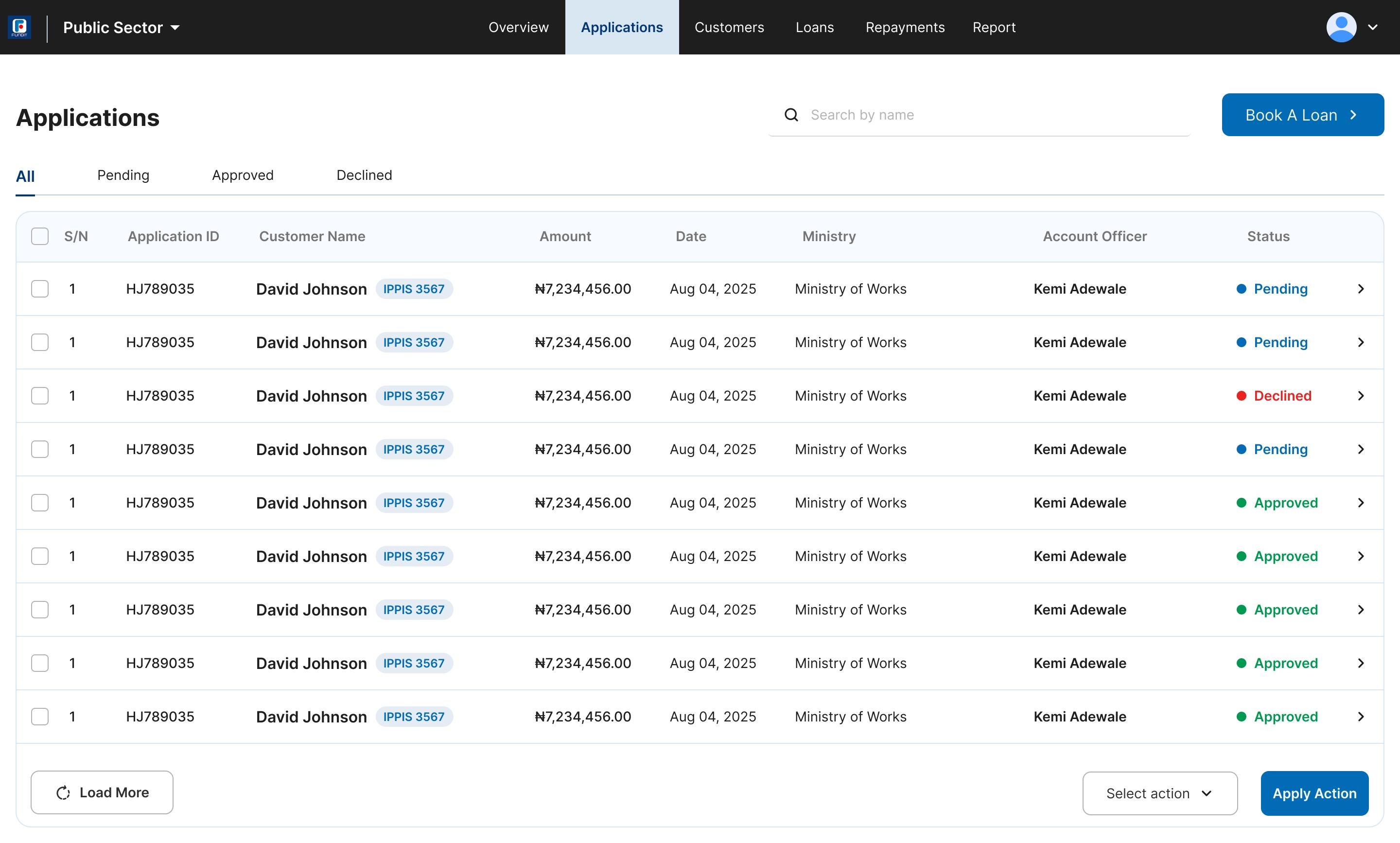
[2] Account officer dashboard.
An internal admin view where account officers manage their clients' loans, from new applications to repayments.
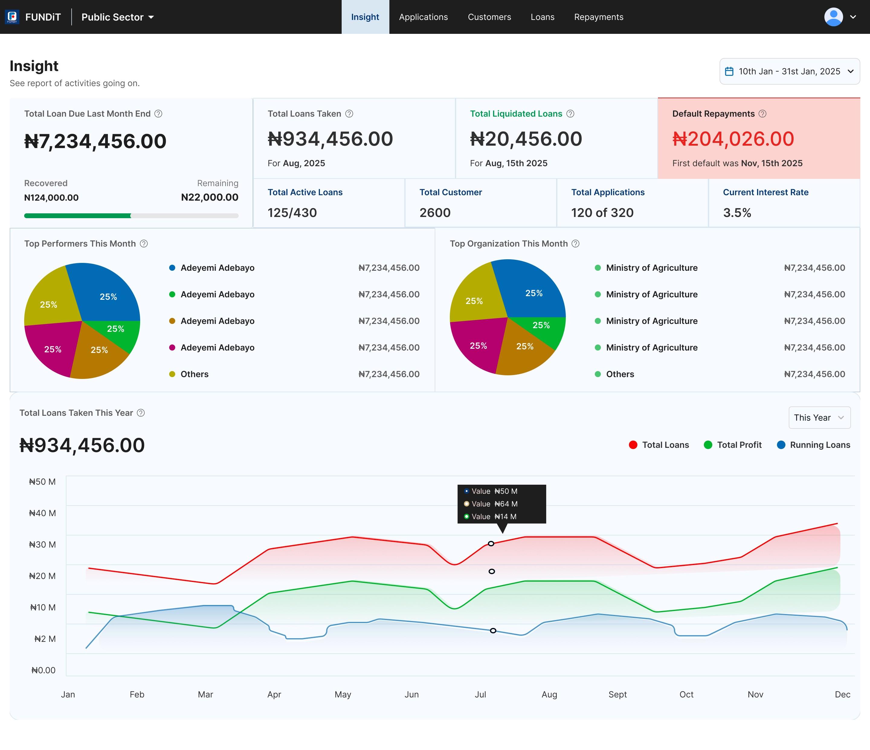
[3] Management dashboard.
An insight view where management tracks loans, repayments and defaults, plus the top account officers and ministries each month.
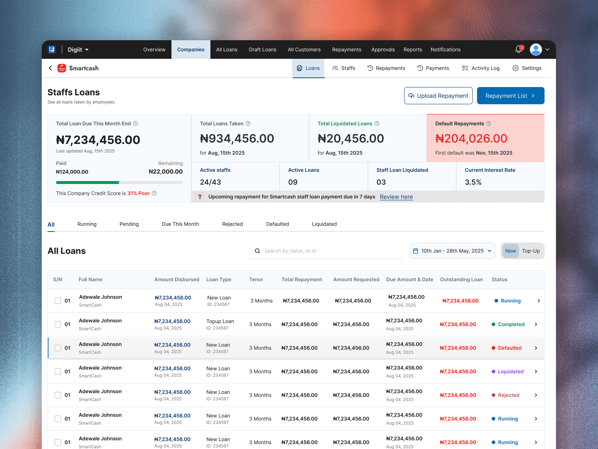
[4] Staff review queue.
One queue replaced Excel sheets and office-to-office approvals. Each request shows which stage it's at and who acts next.
Design decisions
Reuse what works, and design new only where the lending model differs.
Design system
- Reused Digiit's component library (cards, status pills, data tables), so staff move between products without relearning anything.
- Extended the status colours to cover every approval stage, so staff see where a request sits without opening a spreadsheet.
- Added a guided onboarding step for the sales team to convert interested employees faster.
Outcome
Employees serve themselves, and approvals left Excel.
What changed
- Employees apply for and manage loans without calling sales or support.
- Staff work from one dashboard instead of Excel sheets.
- Approvals no longer travel by hand from office to office.
- Sales onboards new employees faster.
What I learned
A lending product can sometimes be mostly about permissions and approval logic, not just visual design.
Designing both sides of a workflow, starting with the customers' needs, helps keep the flow in sync, because you can see exactly where one screen feeds the other's queue.