The Research
I looked at the screens the platform already had and thought about better ways to simplify them.
Where creators got lost
- – Modules and lessons read as a flat list
- – Hard to see where a lesson sits in the course
- – Common tasks buried in a visually flat layout
- – Adding content took more steps than it should
- – Paid platforms like Teachable and Thinkific offer polished creator dashboards
- – Classroomio needed the same clarity
Design decisions
How far can clarity alone go, without adding features?
Hierarchy first
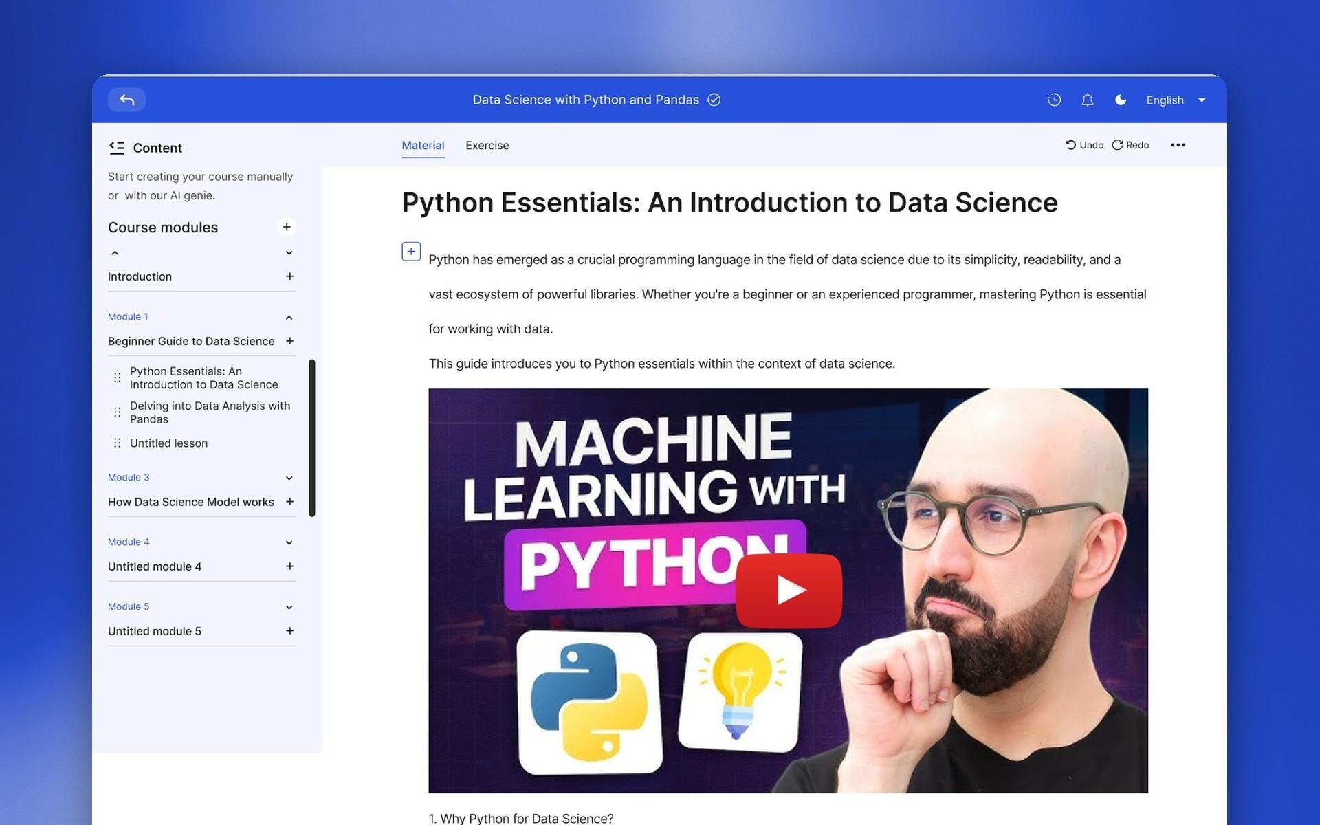
I treated the challenge as an exercise in information hierarchy: take a functional but visually flat dashboard and make the course structure obvious at a glance.
- A clear module and lesson hierarchy in the sidebar.
- A course-building flow structured around the tasks creators repeat most.
- Material and Exercise tabs on every lesson, with rich text and media in the editor.
The core screens
Building a lesson, from an empty page to finished content.
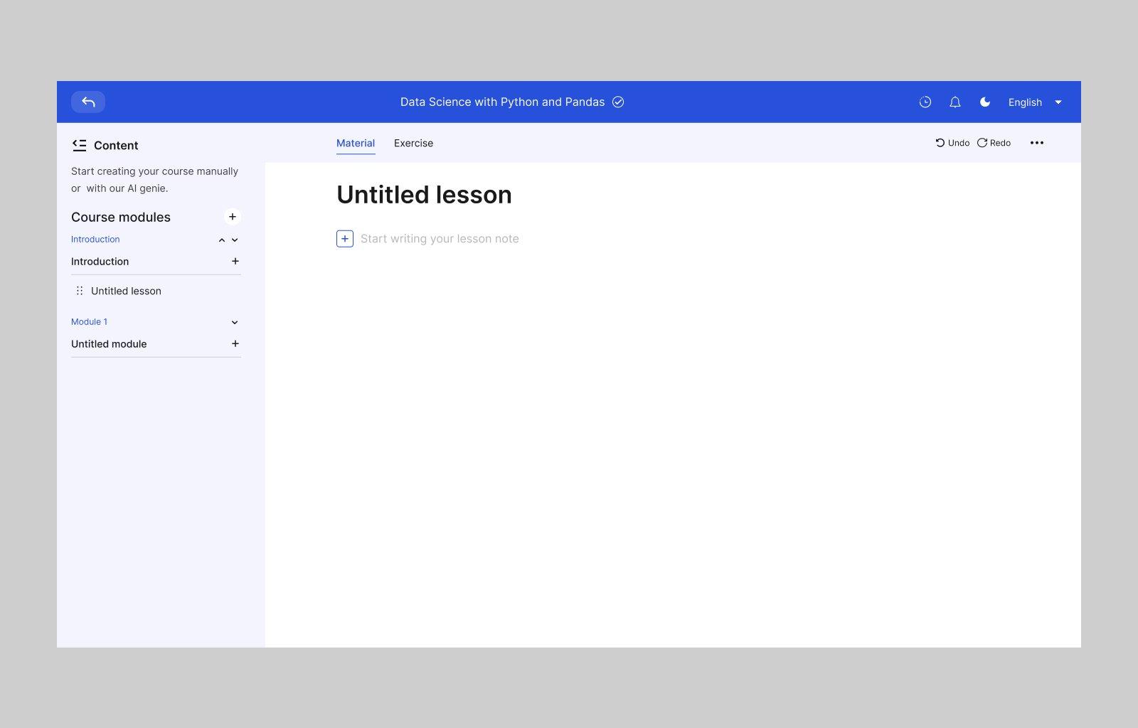
[1] Starting a lesson
A new lesson opens ready to write, with the module structure always visible on the left.
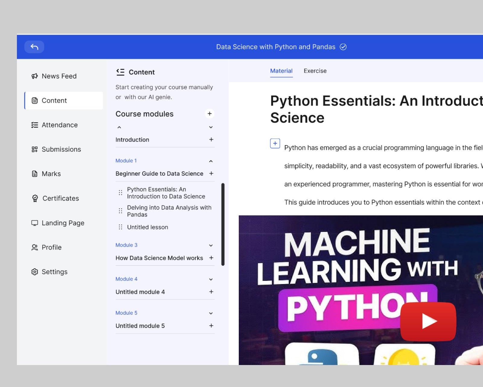
[2] Writing content
Course modules on the left, the lesson material on the right, with video embedded in the lesson.
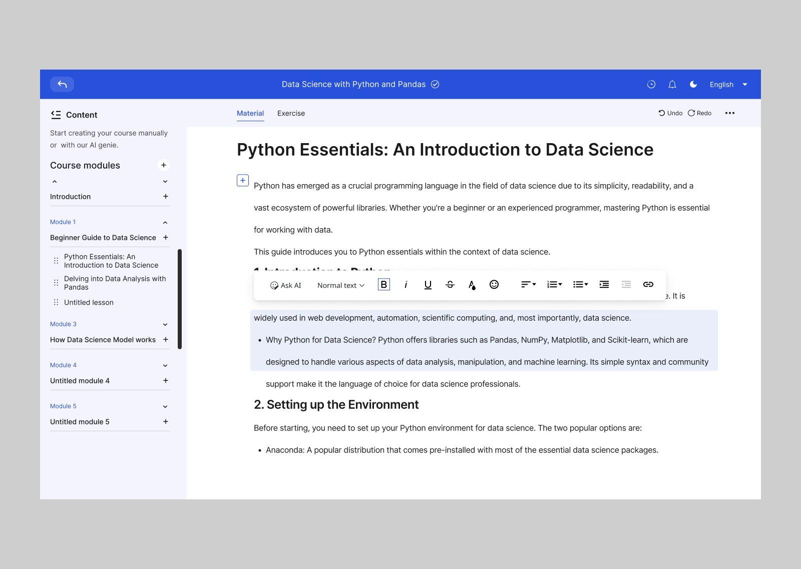
[3] Formatting
A rich-text toolbar for headings, lists, links and code while writing.
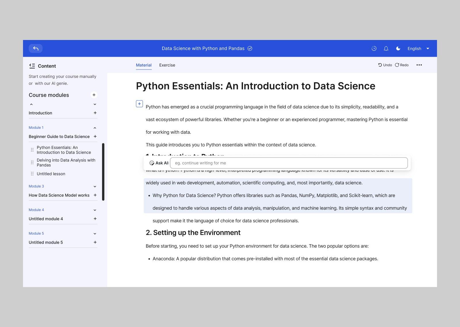
[4] AI writing help
An Ask AI option inside the editor to help draft lesson content.
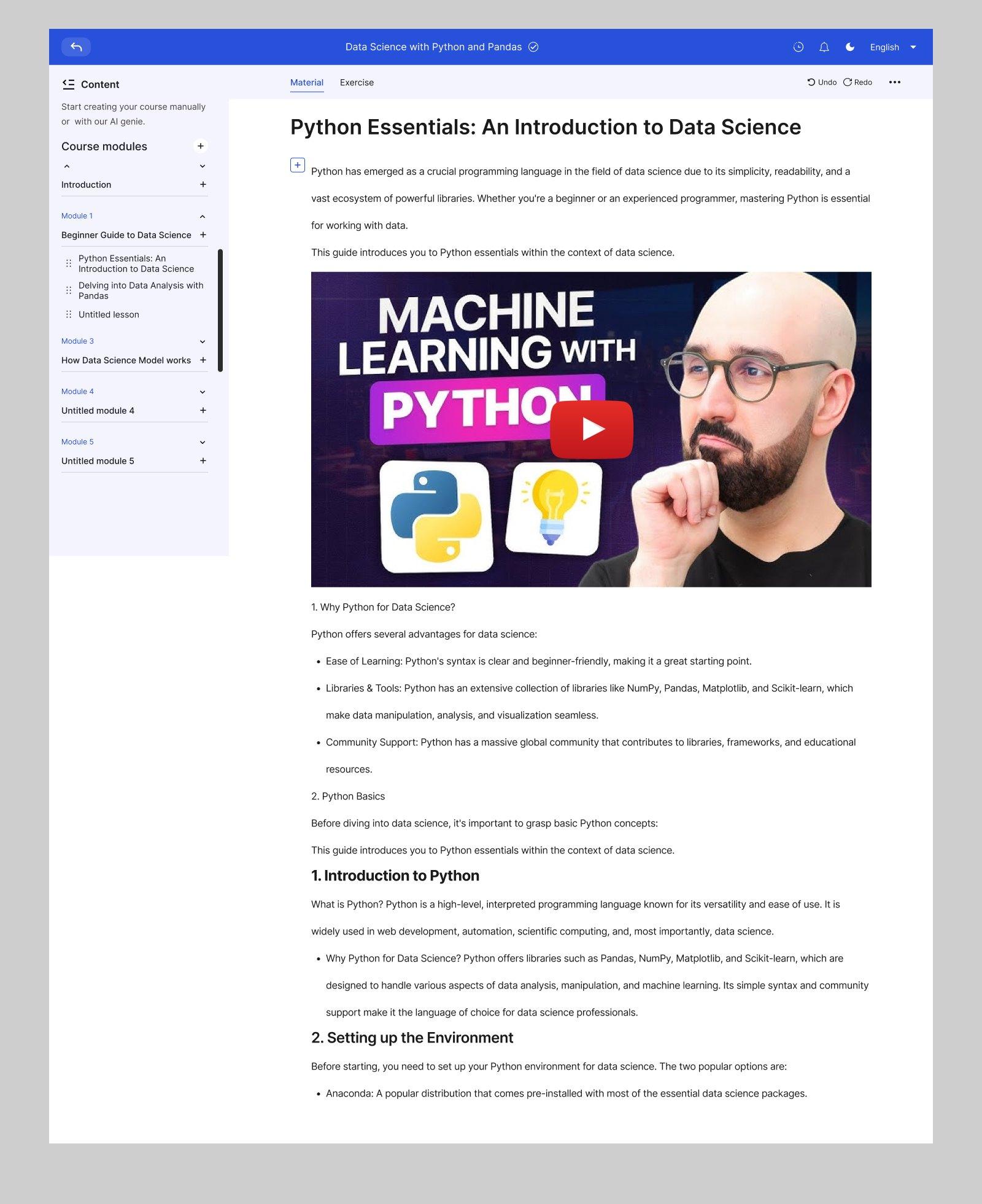
[5] The full lesson
A complete lesson page, from introduction to setup steps.
Outcome
I placed joint 1st runner-up in the challenge, alongside another designer, and won about $50.
What I learned
I learned another way of applying AI for course creators to help them bring their courses to life: combining human thinking and ideas with AI to produce well-detailed courses that are easy to understand.